50 years of Doctor Who

Someone's parked a TARDIS in Bradford City Centre...

Tomorrow, the 23rd November, is the 50th anniversary of the first episode of Doctor Who. A special extended episode, called The Day of the Doctor, will be broadcast simultaneously across the world, and in 3D at selected cinemas.

Sadly I will be out at a friend’s birthday tomorrow and so will have to avoid any spoilers until I get to watch it on BBC iPlayer on Sunday.

The build-up to the 50th anniversary has been huge – doctorwhosavetheday.com has been unlocking short clips once a certain number of tweets and status updates with the hashtag have been posted. There have been a number of specially-commissioned TV shows, such as last week’s The Science of Doctor Who with Professor Brian Cox, and a documentary drama called An Adventure in Space and Time (iPlayer link). And miniature TARDISes have been popping up in other BBC programmes such as Eastenders and Holby City.

The biggest surprise of all was the release of the prequel to The Day of the Doctor, conveniently called The Night of the Doctor:

Without wanting to reveal too many spoilers, the mini-episode fills in some gaps in the Doctor’s timeline.

It’s a very different situation to ten years ago, at the fortieth anniversary in 2003. Back then, Doctor Who had been off our screens for several years, and had a reputation of being a low budget show with wobbly sets and cheesy special effects. Nowadays, the announcement of the new Doctor warrants a half hour special TV show, as happened earlier this year when Peter Capaldi was confirmed as the twelfth Doctor.

I was a bit too young to watch Doctor Who the first time around, so I picked it up with the revived series in 2005, and the ninth Doctor, Christopher Eccleston. And since then I’ve been hooked – never missing an episode and owning many of them on DVD and Blu-Ray. I even read up on some of the background information on the characters, on sites such as the TARDIS Data Core. And I’m not the only one, as many of my friends are fans of the show.

I’m really pleased that such a classic British show is still popular, and, if you excuse the pun, constantly ‘regenerating’ for new generations to enjoy. Let’s hope it’s still going in another fifty years. You never know, time travel may even be science fact in 2063, and not just science fiction… 🙂

App of the Week: Airmail

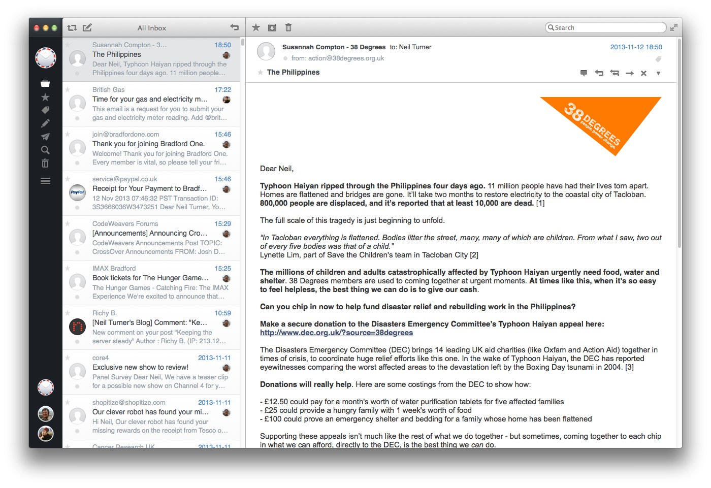
Screenshot of the main window for Airmail, an email client for Mac OS X

After a hiatus of several months (um, July!), it’s time for another instalment of my App of the Week. This week, I’m looking at Airmail, a new email client for Macs.

After Sparrow got bought out by Google last summer, development ceased (bar one small recent update for the iPhone version for iOS 7 compatibility). Sparrow had been my primary choice of email client, after I decided that Thunderbird was overkill for a home user. Earlier this year I changed from Sparrow to Apple’s own Mail app that is built into OS X, after following this guide to customise it.

But now I’ve moved on to Airmail. Like Sparrow, it has a clean and simple interface, support for a unified inbox, and it tries, where possible, to display pictures beside your emails. These can come from your address book, but Airmail also looks for a ‘apple-touch-icon.png’ file on the domain and will display that from time to time, hence the PayPal logo in the screenshot.

As well as supporting IMAP accounts, Airmail will also accept POP3 and even Exchange accounts. It also supports the various IMAP extensions used by Gmail. And like with Sparrow, attachments can be sent using Dropbox as well, although Airmail adds Google Drive, CloudApp and Droplr on top.

Most of all, Airmail seems very fast, light and stable. It opens quickly and doesn’t hang much. And it doesn’t slow your computer down so it’s fine to have running in the background whilst you do other things.

I really like Airmail and I’m happy to have it as my default email client on my Mac. It manages to tread the delicate balance between simplicity and depth of features very well.

Airmail is available on the Mac App Store for a mere £1.49. Bargain.

Upgrading to Windows 8.1

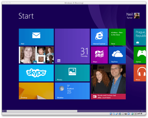
Screenshot of the start screen in Windows 8.1

Yesterday I upgraded to Windows 8.1. I run Windows in a virtual machine on my Mac using VirtualBox, and I upgraded it from Vista almost exactly a year ago. The process was reasonably smooth, in comparison to last year’s debacle, but it wasn’t without some minor incidents.

Getting started

First of all, I wasn’t quite sure how one would go about upgrading. So I opened up Internet Explorer and searched Bing, and it told me to open Windows Store, the app store for Windows 8. So I did, and… nothing. I couldn’t see anything that would suggest what to do next.

Thankfully this page came up with a possible solution. I hadn’t booted Windows 8 in a few months and so I was behind on installing fixes from Windows Update. 35 updates were presented to me; after the first run, all but 1 of these failed, so I rebooted and tried again. This time 4 installed correctly, but again, the others failed. Finally after another reboot I got the rest to install, and so I then rebooted again. This time, upon opening the Windows Store app a full-screen button for installing Windows 8.1 came up.

The first attempt at downloading the update failed, but then it got under way on the second attempt.

Installation

At this point I went to bed and left it to install overnight. I woke up to find the installer asking me to agree to the new license agreement, and to enter my details for my Microsoft Account. Then, it did a little housekeeping, and before long I was back at the Start screen, freshly upgraded. Post-upgrade, there are a couple of contextual tutorials that show you how to do things in the new ‘modern’ interface, which helps.

The verdict on Windows 8.1

I haven’t spent much time with Windows 8.1 post-upgrade but it does seem to be a minor improvement. You can do more things in the modern interface without dropping back to the Desktop – Control Panel, for example, has been largely replicated. However, I still find it harder to navigate than before, with some apps hidden away on the ‘All Apps’ menu, and it’s more difficult to find the ‘Shut Down’ button than on Windows 7. And the new interface is still over-optimised for touchscreen computers – even with an Apple Magic Mouse with sideways scrolling, it still takes longer to do things. Having to hold the mouse pointer in a small corner of the screen to then bring up menus is slow compared to clicking.

Using Windows 8.1 makes you realise why Apple keeps OS X on desktops and iOS and touchscreen devices. Having the old desktop and new modern interface in the same operating system feels like a kludge, especially when you get booted out of one into the other unexpectedly (which happens now and again). And trying to enable it for both touchscreens and mouse-controlled computers results in a compromise that disadvantages the latter, in my opinion.

I don’t think these problems are insurmountable, but let’s just say that I hope there’s a Windows 8.2 that fixes them.