Bluesky is probably now my main social media client. However, the official app doesn’t work natively on an iPad, and so I’m also using the Skeets app to take advantage of my iPad’s bigger screen.
Okay, so the provided screenshot is from my iPhone, but I principally use it on my iPad. It seems to work well – it’s fast, even on my now rather elderly sixth generation iPad which can’t be upgraded to iOS 18. Compared with the official client, it also gives you more control over how your feeds are displayed, allowing you to hide quote posts, or only show replies with a certain minimum number of likes.
The app is free, but you can pay a subscription to unlock Skeets Pro, which adds extra features. These include draft posts, bookmarks, being able to mute words, more control over notifications and rich media in notifications. Currently it costs £2 per month or £18 per year, with a two week free trial.
Skeets is also updated regularly; usually whenever a new feature is added to the official app, it appears in Skeets within a week or two. That said, I don’t feel as polished as, for example, Ivory which is my preferred Mastodon client. Its support for threads also isn’t great – you can read them but posts tend to get duplicated.
If you want to make backups of your DVDs or Blu-Ray discs, or watch them on a device without an optical drive, then MakeMKV is a tool that you should consider.
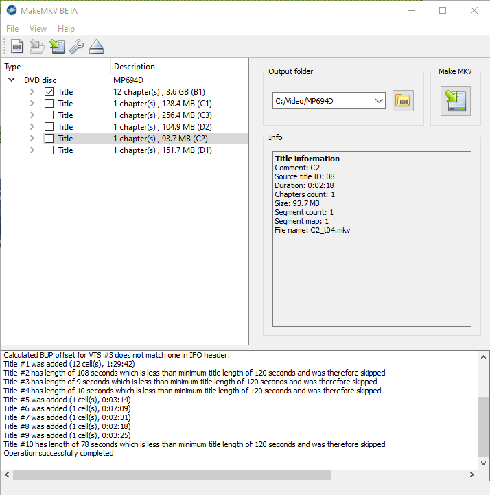
MakeMKV takes the content of your DVDs, and creates a Matroska (.mkv) file that can be read by many media players, including the likes of VLC, Plex and more recent versions of Windows Media Player. Matroska is a very forgiving container format that can accommodate just about any video and audio codec, and has excellent support for subtitles.
What sets MakeMKV apart from tools such as Handbrake is that there’s minimal transcoding. That means that the MKV file will match the quality of the original source, with the same aspect ratio. Handbrake will typically transcode the video into another format and offer to up-scale the video to HD. This will probably result in a smaller file, as newer video formats are more efficient, but every time you transcode a file using a lossy compression algorithm, you lose some of the quality. It also takes longer to convert files using Handbrake because of the transcoding.
The files created by MakeMKV will include subtitles, where these are provided on the original disc, and they’re not ‘burnt in’ so can be enabled or disabled by playback devices. Chapters are also retained.
Overall, it’s easy to use, and doesn’t offer the dizzying array of options that Handbrake offers.
Currently, MakeMKV is beta software, and has been for over a decade – this may explain the rather dated-looking web site. It is shareware, albeit free to use whilst in beta. However, if a final release is ever made, expect to be asked to pay for it. If you want, you can buy it now for $60 (currently £54.25 including VAT).
When you’re a child, your parents are usually kind enough to wash your clothes for you. This means that, when you become a responsible adult and have to wash your own clothes, it can be a bit of a shock. Especially if you own clothes which can’t be shoved in a standard mixed load wash at 40°C.
Most clothes include written washing instructions on the label, but will usually also have 5 symbols on which tell you what temperature you should wash it, whether the clothes can be bleached, tumble-dried or ironed, or whether you should take them along to the dry cleaners. These symbols are essentially a de-facto international standard, which is handy if you’ve bought clothes overseas and the care label isn’t in English.
To help you decipher these symbols, there’s an iOS app called Laundry Day. Give it access to your iPhone’s camera, and then point it at the care label of the garment in question. It’ll do its best to identify the symbols, and, with a tap of the screen, it’ll explain what each symbol means in plain English.
I found that the camera struggled a bit, especially on labels where the text had faded following many washes. In most cases, it wasn’t able to correctly identify all five symbols.
Fortunately, the first tab of the app shows you every possible symbol, so if you’re having no luck with the camera, you can manually select the symbols and still get the information in a readable format. The last tab, ‘Help & About’, also offers some general tips for working with certain types of fabric like silk and wool. There’s a checklist as well – did you empty the pockets first?
It’s a handy little app and I could see many students wanting to use it when they first go to university come September. For years, our student magazine at Bradford used to have a page about washing clothes, with an explainer for the various symbols, in the freshers week issue. I suppose this is the more modern equivalent of it. And it’s more accurate than this list.
Laundry Day is 79p, and available on the App Store for iPhone.
There’s no shortage of weather apps for the iPhone – indeed, it ships with one out of the box. But Carrot Weather is probably the only app that also insults you as well.
Carrot Weather is one of a suite of five apps which are primarily focussed around productivity. There’s a to-do list app, an alarm app, a fitness app, a calorie counter app, and this weather app. What the Carrot apps have in common is a sadistic, judgemental artificial intelligence feature that rewards you for good habits, but insults you if you displease it. So if you don’t complete your tasks on time, don’t meet your fitness goals or sleep in, then Carrot gets angry, and you’ll have to work hard to make her happy again. Her AI is not too dissimilar from GLaDOS, the antagonist of the Portal games series.
Because Carrot Weather isn’t based around objectives, you don’t need to worry too much about upsetting Carrot, but she will still make wry comments about the weather.
The app defaults to showing the weather conditions based on your current location, and the home screen shows the temperature, wind speed, conditions and an overview for the next hour. If it’s raining, it’ll indicate when it’s due to stop, or vice versa. It’s possible to set various other favourite locations, if you want to see what the weather is like elsewhere.
You can also swipe left to see the conditions over the next few hours, and again for a three day summary. Swipe up, and extra detail such as air pressure, visibility, humidity and UV index are available. This information can also appear as a widget in the notification centre, and you can customise how much data is shown.
As long as the mute switch is off, Carrot Weather will also use your phone’s text-to-speech function to speak her comments to you. She will also get angry if you keep tapping on her ‘ocular sensor’, which is the glowing circle that shows the current weather conditions, so, you know, don’t do that.
As you use Carrot Weather over time, various hidden features will unlock. This includes the weather for various fictional locations, such as Mount Doom, where it’s apparently 47° Celsius. I thought it’d be a bit warmer, personally.
If you like an app that’s a bit different and has a sense of humour, then I can recommend Carrot Weather. It’s certainly more fun to use than the weather app that ships with the iPhone.
Yesterday Microsoft unwrapped the latest changes to its OneNote software. Originally introduced with Office 2003, OneNote is now a separate product, albeit one integrated with Microsoft’s OneDrive (previously SkyDrive) service.
The main changes are that the basic OneNote system is free and available without having to buy Microsoft Office, and that there’s now an API for third-party services to connect to. Existing Office 2013 and Office 365 customers get some premium features, but the basic note-keeping and synchronisation tools are available for all at no cost now. There is also a Mac OS X app for the first time, as previously Office:mac 2011 didn’t include OneNote.
I imagine most people will be interested in a comparison with Evernote, which is the main leader in cloud-based note-taking. Though I’m not able to do a full comparison, personally I’ll be sticking with Evernote. The OS X app for OneNote is big (over 400 megabytes when installed) and slow to start up. I’ve found Evernote a bit easier to manage plain text notes, although OneNote offers more flexibility with arranging items within notes. Evernote also lets you export and print notes, unlike OneNote’s free offering.
Other competitors include Google Keep and Apple’s iCloud Notes. Google Keep is Android and web-only (an unofficial iOS app exists), but supports voice memos. iCloud Notes is available on iOS, OS X and the web, but there’s no Windows app and only simple text notes are supported. Whilst I think that the new OneNote is definitely better than Google or Apple’s offerings, Evernote is still the service to beat.
But now I’ve moved on to Airmail. Like Sparrow, it has a clean and simple interface, support for a unified inbox, and it tries, where possible, to display pictures beside your emails. These can come from your address book, but Airmail also looks for a ‘apple-touch-icon.png’ file on the domain and will display that from time to time, hence the PayPal logo in the screenshot.
As well as supporting IMAP accounts, Airmail will also accept POP3 and even Exchange accounts. It also supports the various IMAP extensions used by Gmail. And like with Sparrow, attachments can be sent using Dropbox as well, although Airmail adds Google Drive, CloudApp and Droplr on top.
Most of all, Airmail seems very fast, light and stable. It opens quickly and doesn’t hang much. And it doesn’t slow your computer down so it’s fine to have running in the background whilst you do other things.
I really like Airmail and I’m happy to have it as my default email client on my Mac. It manages to tread the delicate balance between simplicity and depth of features very well.
Until now, cashback web sites have been entirely online affairs. To qualify, you go to the cashback web site, and then click through a referral link to an online retailer and make a purchase. The cashback site then pays you the referral commission generated from that purchase, rather than keeping it for itself.
The ClickSnap app takes this offline, and into real-world bricks and mortar shops. Once you have downloaded the app to your phone and signed in to your Quidco account, it will show you a list of products that have cashback offers available. This can be filtered by store, as not every offer is available everywhere.
The clever bit happens once you have bought the products. Open the ClickSnap app, and then tap the camera button in the top right-hand corner. To prove that you have bought the products, you use your phone’s camera to take photos of the receipt, showing your purchases. The app will allow you to take multiple shots and stitch them together if it has been a particularly large shop.
Once submitted, it usually takes a couple of days for the cashback to appear in your Quidco account. So far, I’ve used it for four purchases, and received cashback for three of them. You can chase up missing cashback after 14 days if you haven’t received it, but it can never be guaranteed that you will get it. Bear this in mind if you buy something just for the potential money back.
Most of the deals in ClickSnap give you money off the product – usually 20-40 pence – but one actually gave you the full cost back as a rebate. So there’s a pack of Hartley’s Raspberry Jelly in our cupboard that effectively cost me nothing, rather than 44p. Some offers require you to buy combinations of products, such as the Coca-Cola and Walls sausages deal in the screenshot. And not all offers are available at all retailers – again, in the screenshot, one of the deals is only redeemable at Sainsbury’s and another at Asda. There is also a limit of how many times you can redeem the offer – usually three or four times.
You will also find that most of the items that are eligible for cashback are branded items. I tend to buy own-brands and usually they’re cheaper than the branded items, even after cashback.
Because of the small amounts, this is unlikely to save you big bucks, but the potential savings may add up over time. And it may make some premium brands more affordable.
ClickSnap is free, and is available on Android and iOS. A Quidco account is required to use it.
Firstly, don’t let the ‘alpha’ tag put you off. It’s not a finished product, and there are some bugs (the Tweet Marker support doesn’t seem to work), but in my view it’s ‘beta’ quality at worst. This is from someone who has done a lot of beta testing in my time, and who also spent part of the week battling some paid-for software that acted like a beta product – but more on that another time.
Secondly, apart from being still in the testing stage, feature-wise Tweetbot isn’t finished. There’s not yet any support for synchronising your Tweetbot settings between your Mac and your iOS device, as this requires use of iCloud and is therefore only available to apps from the Mac App Store that Apple has vetted. This will be in the final release but not in any public test versions. Tapbots also intend for it to support Notification Centre on Mountain Lion, which, as well as being another Mac App Store-only feature, is also not available to test because only a few select developers have copies of Mountain Lion at present.
It’s also worth pointing out that, whilst this alpha build is free to test, there’s no support; furthermore, the final product will cost money, as with the iPad and iPhone apps.
So, with those caveats pointed out, what it’s actually like to use?
Well, it works pretty much like any other Mac OS X Twitter client, to be honest. The main difference between the iOS app and the Mac desktop is that, whereas on iOS, tapping a tweet brings up a bar with buttons to retweet, reply and favourite, these now appear when you hover over a tweet with the mouse. But you’ll be pleased to know that the swiping gestures from the iOS app made it to the dekstop, so swiping from left to right shows the tweet details, and from right to left shows the tweet in a conversation view with its replies.
‘Streaming’ support, where new tweets are automatically loaded as they are posted, is enabled as standard. Along the left column, all of the various views are shown, like on the iPad app, so there’s easy access to your profile, lists, retweets and saved searches. And this desktop version of Tweetbot retains its formidable support for third-party services, so there’s integration with Pocket, Instapaper, Readability, Pinboard and bit.ly as a ‘read later’ service (most other apps just offer the first two and Readability if you’re lucky), plenty of third-party image hosting services (but not a custom one yet) and a choice of URL shorteners. And curiously for a desktop client, you can add a location to your tweets.
The other great thing, for me, about Tweetbot is its mute feature to hide tweets that don’t interest you, and this feature is also present on the desktop. So far, in this alpha, you can only mute specific Twitter clients, like Twittascope, RunKeeper, Waze, GetGlue or any other services which auto-tweet things that don’t really interest me, but eventually you will be able to mute specific hashtags or keywords, or put some users on mute – this is great when you follow someone who live-tweets a conference and would otherwise dominate your timeline. The mute settings will also be synchronised between clients when iCloud sync is enabled in the final release.
All in all, in my opinion Tweetbot as it is now – even in its alpha state – is still better than the official Twitter client for the Mac, and just beats out Osfoora which was my previous favourite (I reviewed it back in March). If you use Twitter on a Mac, and have Lion installed, give it a try whilst its free, and, if you like it, buy the final release when it comes out. I don’t think you’ll regret it.
A few months ago I decided to stop using Google’s Picasa for editing my photos and instead switched to Apple’s iPhoto. Doing so has been an enlightening experience and although (spoiler alert!) I prefer iPhoto, I also think it’s worth mentioning why I switched but also what Picasa has going for it.
Firstly, a bit of background – I’ve been a Picasa user for quite some time (since January 2005 apparently) and used it prior to becoming a Mac user. In the early days of Mac ownership I used CrossOver to run it, before later running the Mac OS X version of it when that finally came out. I never really touched iPhoto until this year, when I bought the latest version.
I’m therefore comparing iPhoto ’11 with Picasa 3.9.
Price
Unless you have a reasonably new Mac, you probably won’t have iPhoto ’11. If you do, then it’s free; if not, it’s a £10.49 purchase from the Mac App Store. Picasa is a free download so it wins there.
Image editing
In my opinion, iPhoto wins here as it offers many more features for making adjustments to photos. Both will offer basic features for adjusting light and colour balance, and a one-click button (‘enhance’ in iPhoto, and ‘I’m Feeling Lucky’ in Picasa – it is a Google product after all) to automate this. The one-click enhancers in both were a little hit and miss – I found iPhoto sometimes over-saturates pictures whereas Picasa makes them too bright. But iPhoto excels by also offering noise reduction and better controls for lighting pictures – I was able to fix a few of my under-exposed images much more easily in iPhoto than Picasa. On the other hand, Picasa also supports Instagram-style filters should you wish to apply those.
Speed
iPhoto is slow. Like, really slow. If you like seeing the spinning beach ball, then you’re in luck because you’ll see it a lot in iPhoto – especially when you have more than a couple of other apps open at the same time. Picasa is much faster – which seems odd, since Picasa is a cross-platform app written by Google, whereas iPhoto is native to OS X and by Apple. Apple didn’t announce any updates for iLife at WWDC earlier this week but hopefully efficiency improvements are on the cards for iPhoto ’13.
Sharing
If you want to share your photos with others, both apps will let you upload them to the internet. Picasa supports its own Picasa Web Albums service, with two-way synchronisation of photos between your computer and your Web Albums account, as well as Google+ and Blogger. iPhoto supports Facebook and Flickr, and users of OS X Mountain Lion can also share pictures on Twitter. For me, support for Facebook and Flickr is far more useful than Google’s own properties, but this depends on what you use.
Incidentally Google used to offer an Export plugin for iPhoto that would allow you to export from iPhoto to Picasa Web Albums, but this is no longer in active development and has been removed from the Picasa web site. You can still download it from MacUpdate though.
Interface
Of the two, iPhoto is naturally more Mac-like, although it does use a number of non-standard user interface conventions (in comparison to other Mac apps). Picasa feels like an app brought over from Windows – which it is – and the interface is thus less visually appealing. I also found that iPhoto presented its features in a clearer and more easily accessed way – Picasa has a habit of hiding things in menus.
Slideshows
Both apps will let you create slideshows from your images. To me, iPhoto slideshows look more professional, and allow you to easily import music from iTunes to accompany it. On the other hand, Picasa will let you export your slideshow directly to YouTube; iTunes merely saves a QuickTime file and you’ll need to either upload it manually or use Apple’s iMovie, sold separately, to get it on to YouTube.
Other bits
iPhoto will let you order prints and other printed items from within the app itself, which is a nice touch – with Picasa it’s necessary to export images first, and then use a third-party service. iPhoto also lets you browse your Flickr sets and Facebook albums from within the app itself, which includes the use of the slideshow features.
Both will let you tag people in your photos, so that you can also browse by person as well as folder or event; iPhoto uses contact information from your Address Book and Facebook, whereas Picasa uses Google Contacts and Google+. When you upload these photos to Facebook or Google+ then these people will be automatically tagged if you are friends with them or have circled them.
In my experience, Picasa doesn’t see, to get much attention from Google; version 3.9 was still the most recent version as of December 2012, having been out for 9 months; iPhoto has had several minor updates in that time such as adding support for Twitter sharing. Finally, iPhoto naturally supports full-screen mode in OS X Lion and Mountain Lion, which Picasa does not as yet.
Summary
On the whole I feel iPhoto has more to offer than Picasa, but by switching from one to the other I’ve had to sacrifice some features (and speed). Consequently I imagine that there are some people for whom Picasa will clearly be the best option – but, in my case, it isn’t.
This post was revised in December 2012 to add more information about slideshows, Twitter sharing, photo tagging and Picasa updates.
I’ve reviewed several Twitter clients over the past couple of years, and just over two years ago I had a look at Tweetie, which was a freemium Twitter app for Mac OS X and at the time my preferred choice of Twitter client. The developer of Tweetie later got hired by Twitter themselves and with the launch of the Mac App Store last year came an official Twitter for Mac client based on Tweetie.
Until recently this was my favoured Twitter client on my Mac, but having used Tweetbot on my iPhone for some time I felt that I wanted a more powerful desktop Twitter client too. Osfoora had just been launched, so I gave it a spin, and I have to say I’m impressed.
The interface is apparently very similar to Twitterific, a veteran Twitter client that I’ve never really used before, but it’s also very similar to the official Twitter for Mac app so users should feel quite at home with it. I’ll therefore focus on what sets it apart from the official app.
Firstly, it supports the rather useful Tweet Marker service, which lets you bookmark your position when reading through your timeline. If you read every tweet in your timeline and use multiple devices (like a PC and a smartphone), Tweet Marker allows you to read some tweets on your phone (while travelling home on a train for example), and then pick up where you left off on your PC at home. Tweetbot also supports this on the iPhone. It’s a free service but donations are requested.
Moving on, as you’ll see in the screenshot, thumbnails of images in tweets are shown inline, so that you can easily see a preview before clicking them to view them full size. This is good as sometimes you’ll click on an image that looks interesting to find that it’s actually rather boring, or worse, an announcement that you’ve lost the game (sorry). Popular image services like TwitPic, yFrog, Instagram and Twitter’s own image hosting service are supported.
When composing a new tweet, you can include the title of the current song that you’re playing in iTunes by simply clicking a button, and like with the official client typing ‘@’ allows auto-completing of Twitter handles if you want to mention someone.
In terms of more advanced features, support for Read It Later and Instapaper is included, so you can save interesting links to these services for later reading. This isn’t as useful as it is on a mobile app, but I’ve still found myself saving links for later reading. You can also ‘mute’ specific usernames, in case someone you follow starts tweeting more than usual about something that you don’t care about and want a bit of a break. Conversely, you can also have tweets from other usernames highlighted, if you feel they’re more important than other tweets on your timeline. Unlike Tweetbot, Osfoora doesn’t yet support the muting of hashtags (which is useful when TV shows like X-Factor are on) or muting of clients (to hide tweets about what TV shows people are watching, what games they are playing or where they’ve checked into on Foursquare, for example). This would be useful to me.
Like most third-party clients, you get a choice of URL shorteners, rather than using Twitter’s own, although CloudApp is currently the only other one supported – no support for bit.ly, for example. Similarly you don’t have to use Twitter’s own image hosting service if you don’t want to.
Osfoora doesn’t yet support live streaming – tweets are refreshed on a schedule. However, this can be set to every minute if you wish, and support for live streaming should come in a future update. A nice touch is that a small message briefly appears at the bottom of the timeline stating how many tweets were received at the last refresh – although Osfoora also supports Growl notifications, I find this less jarring.
Finally, there’s support for multiple Twitter accounts, although each account gets its own timeline window. You can hide them though, or just use one window and use a keyboard shortcut to cycle through them.